 This is a poster about design culture.
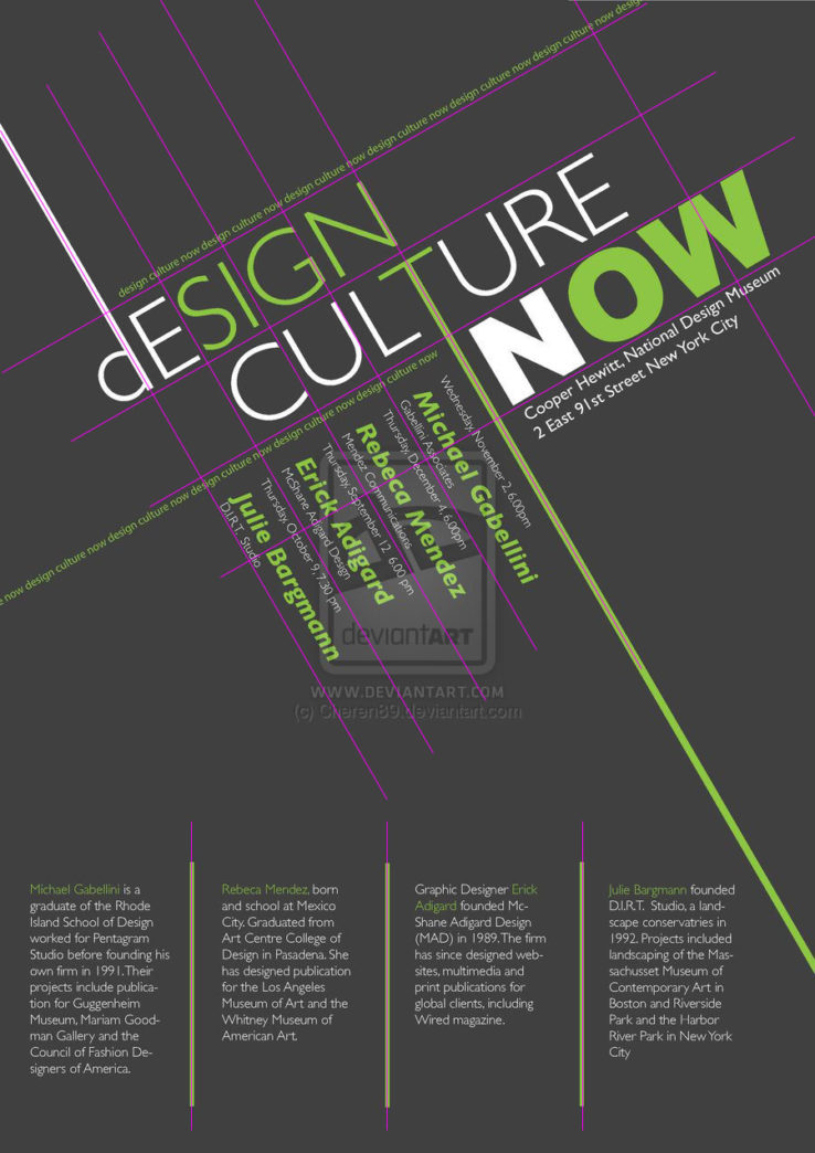
Hierarchy:
- The most visible text in this poster is the word Now. Along with it are some smaller white description of the location of the event.
- Then comes the title design culture. Along with it are some tiny green words repeatedly saying “design culture” and function as decoration.
- The third visually important are the four green names just below the title. Along with them are some tiny white descriptions about them, on top of each name there is a time of event, while below a name there is probably the place a person comes from.
- The visually least important are the four detailed descriptions about the four lecturers at the bottom of this poster.
Pros: I think the design is cool because it divides the space with some slanted lines. And it adds some details to each of the four hierarchies, making it more varied and visually interesting.
Cons: The hierarchy could be better. In my point of view, I think the importance of the title should be greater than the word “Now”. And time should be more important than the place where those lectures from, but it’s actually hard to find than the place of this event. Besides, there is some redundancy in the design because the names of the four lectures are stated twice, which in my point of view can create some confusion about the information at first glance, such as you want to find the time of event and look at the bottom because there are lecturers, and thinking they should cover everything about the lecturers and lectures, but found nothing there.
Grid:
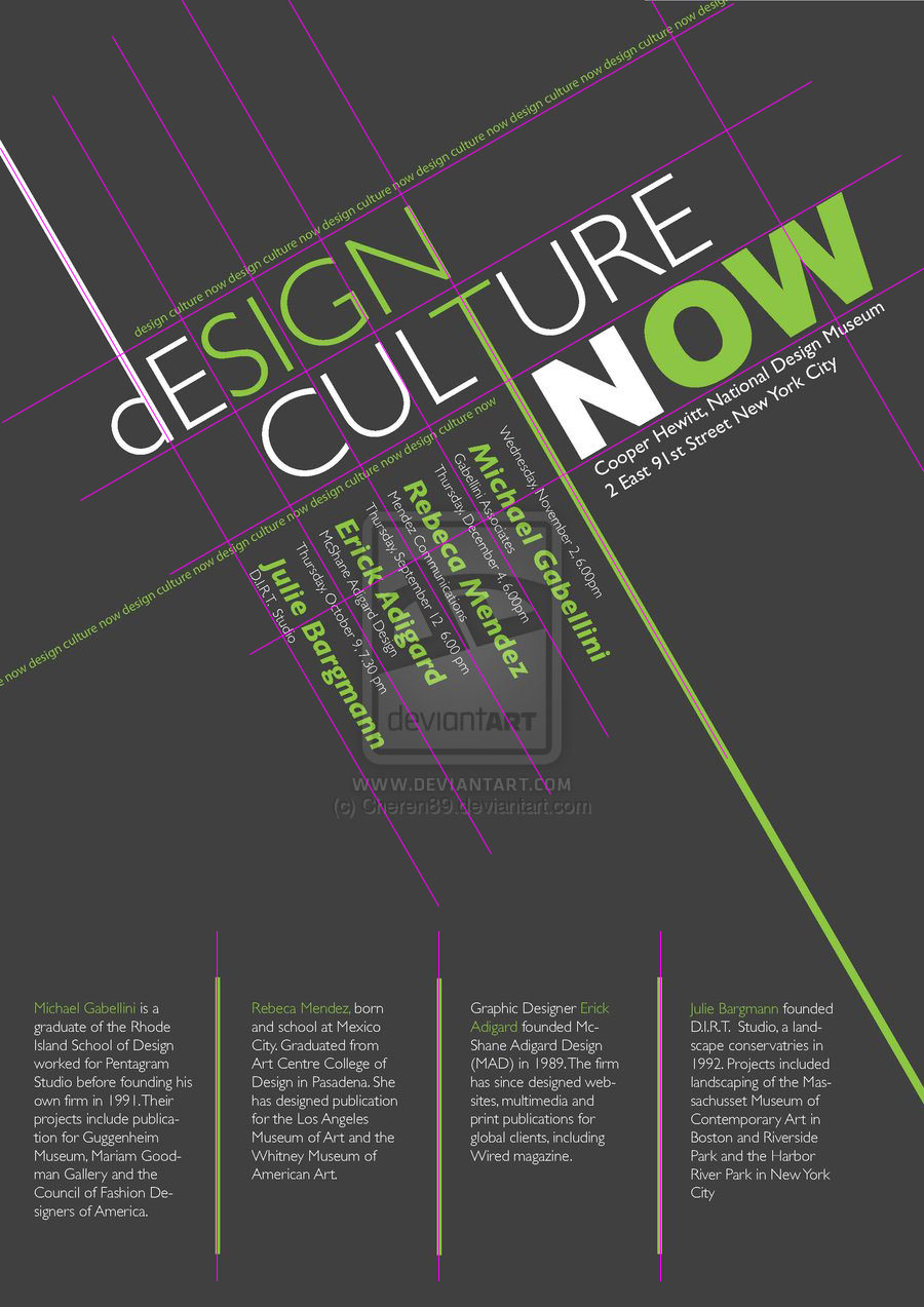
- Design culTure noW on the letters D, T and W.
- Design Culture Now horizontals
- The space between four names align with part of the letters of Design and Culture.
- Partial 4th dividings at the bottom
Color Pallete
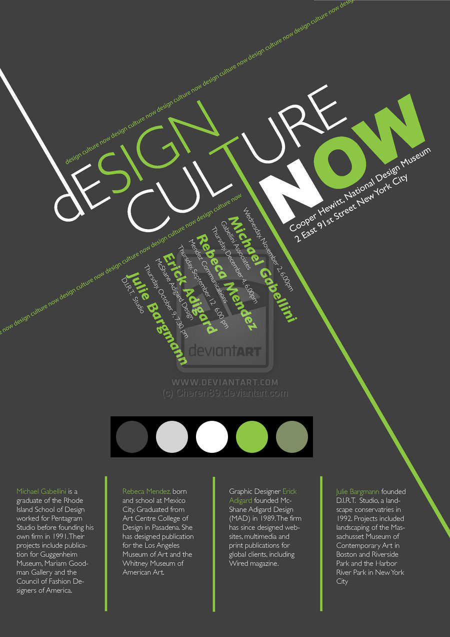 There is actually only one tune – green, combined with gray scales. There are three variations of grayscales: dark grey, light grey and white. And there are two variations of green: light green and a slight darker green.
Typefaces

Arial Black

Gill Sans Light from Monotype Gill Sans
![]()
Sowhat maybe a kind of rounded font like Arial Rounded
![]()
The result says it’s FF Zwo OT Bold Italic, but not exactly.